Optimizing the Home Assistant mobile web app
This blog post will go into detail about the recent performance optimizations that went into the Home Assistant front end. For people not familiar with the app, check out the demo and the source.
TL; DR: Don’t hack the framework, separate responsibilities, ship less, use service workers, use (future) web standards.
This year at Google I/O I saw Monica from the Polymer team talk about web components and performance. In her talk she mentions a mantra that they use in the Polymer team to make things fast: Do less and be lazy.
Do less and be lazy. It sounds so obvious and it took a while before it started to dawn on me. I think most of the code I write is pretty fast, but I don’t often stop to take a harder look at how and when it runs in practice. When do we need the result, can it be postponed?
And thus started my journey to take a critical look at how the Home Assistant app was working and how to make things faster. Below is the list of the different things that I did to make it fast.
I hope this list can be useful to other people, as a guide for optimizing their own apps or for avoiding pitfalls when building a new one.
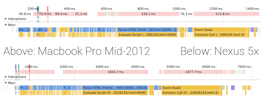
The first thing to do is to measure. The Home Assistant front end is a mobile web app, so we shouldn’t measure this on a machine with 8 cores and gigabytes of ram but instead measure on devices you expect a mobile web app to run: phones. Below are two timelines recorded with Home Assistant 0.18.2 (pre-optimizations) and Google Chrome 53. On my Mac the app starts in 1400 milliseconds and on my Nexus 5x in ~6500 milliseconds (~4.5 times slower!).

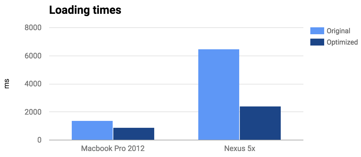
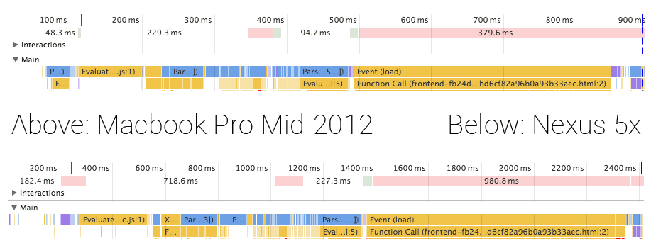
Although the app takes 6500 milliseconds to load on my phone, it would perform well afterwards. Still, that initial load is unacceptable. You expect to open an app on your phone and be able to use it, quickly. After I applied all the changes described below, I managed to reduce startup time to 900 milliseconds (-35%) on my Mac and 2400 milliseconds (-63%) on my Nexus 5x. Check out the demo here.


Technology
The Home Assistant front end consists of two parts. There is Home Assistant JS, which controls all data and interaction between JavaScript and the server. It is a Flux architecture using NuclearJS and ImmutableJS. The UI is implemented by Home Assistant Polymer using Polymer and web components.
Don’t hack the framework
I thought to be smart. I split out the JavaScript part of all web components and bundled them separately using Webpack so that I could use ES2015 via BabelJS (architecture). This is not how Polymer components are written and it meant that I was unable to use any of the tooling that is available in the community or easily split up the bundle (more on this later).
So I went ahead and backported all my web components back from shiny beautiful ES6 to ES5. And you know what? It’s not that bad. Yes, not being able to use the concise object notation and arrow functions make your code more verbose. But in the end it is the same code that is running in browsers.
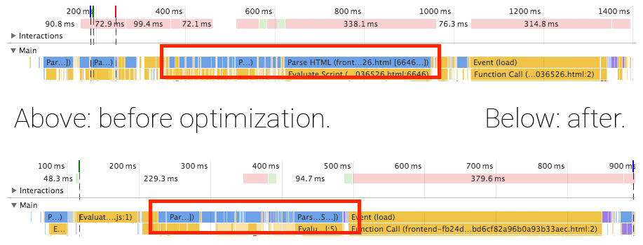
Another benefit of having each web component contain their own script tag is that the browser will process them one by one, allowing the browser to render our loading spinner animation in between.
As you can see in the timelines, we were able to get rid of most of the blocking component loading.

Separate responsibilities
Whenever you learn a new technology, you feel like you’ve learned a new superpower. Wow, I can do all this with only 2 lines?! I had the same with bundling.
I was initially very focused on shipping just a single file with everything that my app needed. The entry point would be my main component which would require all of its Flux and UI dependencies. Then, just before it all would be rendered, it would check if there is authentication and start the data fetching.
This is a very bad pattern. This means that you will not start any data fetching until your UI is ready to render. Instead, you want your data to be fetched as soon as possible, and while the request is out to the server you want the page to load all your UI components.
To accomplish this I extracted the application core out of the main bundle. In the current optimized version it’s 31.1kb gzip’d. It is loaded before any other scripts so that it can start fetching data as soon as possible.

When the data does come back before the UI is done loading, we can process it before we start rendering the UI because of all the web components being processed individually. This means that we don’t have to show a loading screen the first time our components render – we can just render the components with the data they require.
Ship less
The theory behind this one is simple: if we manage to ship less code, the browser has to process less code and it will start faster.
Only include the components for the page that you will show
The Home Assistant mobile web application has 10 different panels (pages). Besides that, it also has a dialog for each type of device to show more info. That’s a lot of components and screens of which only a very small set is needed at the start. That means that we are shipping a lot of unnecessary data that the browser has to process before our initial render!
I broke up each panel of the app into a separate bundle that will be loaded on demand. This saved 250 kilobytes (pre-gzip) on just the embedded map alone! This change, however, required some significant changes to our build process.
Breaking up an app in JavaScript is complex because each module explicitly imports their dependencies. This has to continue to work in your browser after breaking it up in multiple files. Web components do not have this problem as it’s part of the platform and thus your browser is the registry! An unregistered web component will be rendered as an empty span element until the element gets registered. Loading order is not important.
// Example of the flexibility of web components.
var spinner = document.createElement('paper-spinner');
spinner.active = true;
document.body.appendChild(spinner);
Because the browser tracks your web components, creating standalone bundles for parts of the app is easy:
- Find all dependencies included in the main bundle (using hydrolysis)
- Create individual bundles of each panel (page) but filter out the dependencies included in main bundle.
The build script that bundles and minifies the main bundle and panel bundles is <100 lines.
Change the JavaScript bundler to Rollup
Core.js is still pure JavaScript and requires bundling. In my journey to get a smaller bundle, I went from Webpack to Webpack 2 to Rollup. At each step the bundle got smaller. Rollup is the big winner here because it doesn’t wrap all your modules in function calls but instead concatenates all files with minimal changes to make it work. This not only reduces the file size but also the loading speed. This is because the JavaScript engine will no longer have to invoke a function to resolve each import, it’s doing less work. This might not mean much for a computer but on a phone, everything counts.
Scrutinize dependencies
If the goal is to ship less, it’s time to take a good look at dependencies. It’s so often that we decide to fall back to yet another NPM package that makes our life a little easier but comes at the cost of size – size usually taken up by functionality that you might never need.
Remove Lodash
I realized that I only used a few methods of lodash. Lodash (and previously underscore) used to be one of the dependencies that would always be one of the first things that I would add to any project I start. But I could no longer justify it in the case of Home Assistant. Even with dead tree shaking it was not worth including it. Yes, they support a lot of edge cases but those were not relevant to my use case. And standalone lodash packages are still huge. The only thing that I couldn’t replace with a few lines of my own code was debounce. However I found a 40 line replacement.
Replace moment.js with Fecha
Moment.js is one of those power libraries. It is able to handle any date problem that you can throw at it. But this obviously comes at the cost of size. Fecha is a date formatting library at ~8% the size of moment.js (only 4.7kb pre-gzip). The only thing that it does not contain is date manipulation, which was something that was not being used.
Use Service worker to instantly load the app
Using a service worker we’re able to store all app components and core javascript in the browser. This means that after their first visit, the browser will only have to go to the network to fetch the latest data from the server.
Creating a service worker is easy using sw-precache, a service worker generation tool.
When a browser does not support service workers, Home Assistant will serve fingerprinted assets that are aggressively cached. Only when the content changes will the client redownload the asset.
Using fingerprinting with sw-precache required jumping through a few hoops. The final build script can be found here.
Make it feel fast
This one is more psychological: no one likes staring at a white screen because white screens are ambiguous: are we loading something, is there a crappy connection or maybe even a script error? That’s why it is very important to render something on the screen to show that the rest is being loaded, and as quickly as possible.
The Home Assistant landing page contains just enough CSS and HTML to render the loading screen minus the animations.
Now that the app is fast enough, I might swap out moving from a lite loading screen to drawing an empty toolbar. This makes it look like the UI is almost there.
Using a framework build on web standards
I left this to the end of the list, mainly because I had no influence on this. Polymer just happened to ship an update while I was optimizing the application which gave a big boost to the loading time.
By using Polymer we have the ability to use tomorrow’s web standards today. This is powered by polyfills. A polyfill will use JavaScript to simulate the behavior that the web standard would have taken care of. As browsers progress, more work can move from the polyfills back to the browsers. This is great because browsers will be able to optimize the work better and thus be faster.
Polymer 1.6 was introduced at the end of June and allowed the app to take advantage of native CSS variables in Chrome and Firefox. It also introduced lazy registration. Both greatly sped up our loading times.
Future optimizations
A lot of optimizations have been applied but this journey will never be over. There are still a lot of opportunities to make things even faster. Some ideas that are on my list to explore:
- Use shadow DOM instead of shady DOM polyfill.
- Use closure compiler to optimize the JavaScript.
- Reduce the number of icons that are loaded.
- Embed initial API response in served page if not using a service worker.
- Reduce size of initial bundle by moving out all things that are not visible for initial paint. For example the dialogs that show more info about entities.
- Prefetch the other pages using
<link rel="preload" …>